148. Lovely Package
Clearly I’m back in school again, because I’m in class and have the time/level of boredom to continue in my blogging efforts.
Lovely Package is a website celebrating innovative and beautiful design on products. There are some truly beautiful pieces of design here, both student design pieces and true packaging that one would find on store shelves.
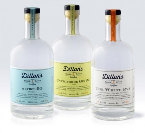
Here, we have a photo from Dillon’s Small Batch Distillers. I love the old-fashioned labels on here.
Here, Hardeger Huppen biscuits.
Finally, Sweet Botanicals.
My one complaint is that there are a lot of very similar aesthetic choices celebrated on here. Clearly, the people behind Lovely Package have a clear design preference and kind of limit what they feature to a very specific look. Lots of busy, folksy designs, which I’m not a huge fan of. For example:
147. I Love Egg
I learned about this video my freshman year of college – almost six years ago, now – from my dear friend James. He is a connoisseur of all things hilarious and Asian, and “I Love Egg” is no exception. As soon as James found out that I love all those things, too, he shared this treasure with me. I really super wanted to embed it here, but apparently that’s impossible. So you’ll have to deal with a link, a description, and a screenshot.
This video is a bouncing, cheery song about eggs. I assume, from the lyrics, that it’s a PSA about how good eggs are for you. Or, in their words, how “popular and perfect and so complete in every way!” I love the catchy tune. I love the childish voice singing it. I love the weird eggs with faces. I love the ninjas. I love the slightly threatening “Chip a chip away your shell and COME. TO. ME.” I just love egg.
Also, guess what??!!? Apparently, there is I Love Egg merchandise. Hungry? Here’s an I Love Egg snack:
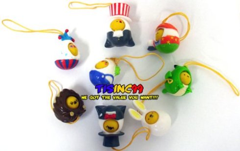
You can also get some little charm-doodles on Amazon:
Who KNOWS what else is out there!??!! Man. Life is GOOD when you love egg. Oodle doodle.
UPDATE:
Found a video to embed. Not the best sound quality, but it does the job.
146. Pop Pop’s Art
Henri Rousseau was a French painter in the 19th and early 20th centuries. He had no formal training, and his painting style was very flat, with strange light and color. There was an argument, at the time, whether Rousseau was a brilliant, avant-garde surrealist, or just a talentless hack. Over time, the argument that he was a talented visionary has won out over its more mean-spirited cousin.
I think the same argument could be made about Pop Pop’s art.
When Pop Pop retired, he became a painter. After a life spent in retail and marketing, Pop Pop wanted to explore the world through color, line, and texture instead of through dollars and cents. And, really, who could blame him? Money is so monochromatic. It’s so stark. It has none of the vibrancy of, say, a bowl of fruit. So Pop Pop painted.
His first painting was from a picture he clipped out of a magazine. The picture was of a small cabin in the woods, surrounded by trees and a field of mushrooms. In Pop Pop’s interpretation, the mushrooms are as big as the cabin. Some in my family see this as a lack of skill. I see this as a brilliant artistic choice, adding a sense of surreality to an otherwise plain painting. I wish I had a picture of this painting to show you guys, but it’s my Grandma’s favorite, and on lock down above their mantle. I’ve called dibs on it when the grandparents die. It’s the only inheritance I want.
The first painting I got from Pop Pop is a still life. It was “based” on a Cezanne, which Pop Pop clipped out of a magazine and attached to the back with masking tape. I love this painting for many reasons. First, Pop Pop quickly diverts from Cezanne’s muted colors and light. Instead, Pop Pop paints a garish turquoise background, complemented by an equally garish yellow tea towel. Pop Pop’s colors truly pop. None of this subdued, impressionist bullshit. Second, I love the fruit. Sure, you can tell what it is, but it looks rotten. Perhaps this is a visionary statement on the state of the world today? On our own perceptions of quality and value? Finally, I love Pop Pop’s broad, irreverent brush strokes. Nothing says “Fuck you, artistic conventions!” like a broad, inexact brush.
This seriously might be my favorite painting in the world. I have it hanging in my living room, and get asked if I painted it every time I have anyone over. I always have to ‘fess up that, no, this visionary masterpiece was done by my grandfather, not me.
In recent years, Pop Pop’s vision has declined to the point where he’s had to stop painting. It breaks my heart. But he still loves to take people on a tour of his “gallery” in the garage. Grandma has his art displayed all over the house – to the tune of 15-20 pictures on display throughout their two bedroom house. Pop Pop, after 87 years of a supremely practical life, has become a legitimate painter. He has his art displayed in his house. He gives it away to the kids and grandkids, so that my parents, my dad’s sisters, my brother, and I all have some Pop Pop art in our homes. And I could not be more thrilled to display these surrealist masterpieces, with the added joy of saying, “Yeah, my Pop Pop did that.”
145. My Holiday Card
This year, I decided to send out a holiday card from me and Buckley. I bought matching green sweaters for us, but I wanted to make it one step kitschier. My friend Torie was going to take the picture for us, and she offered to photoshop us in front of a fireplace. And then I had a brilliant idea.
I’d make my own fireplace.
I went to a store and bought some colored poster board, and set to work. I love working with cut paper – it’s the one time my art projects turn out at all decent looking.
Here is the evolution of my fireplace, from start to finish.
So, my fireplace was complete. Next step was to take some photos. Torie did an excellent job, and we came out with a fantastic photo. I sent it out last week, and have gotten some great feedback already! Here’s the one we chose:
I totally love how it turned out! I think I’m hilarious.
Plus, bonus pics of Buckley in a sweater.
144. Jacques Torres Chocolates
My parents’ apartment in New York is at 74th and Amsterdam. Less than a block away is perhaps the best chocolate store I’ve ever been to – Jacques Torres. Jacques Torres has become a huge, popular fad in New York. Everyone is kind of obsessed. And my family is no exception.
Their chocolates are their most popular product. And for good reason – they’re really good. I’m sure they’re all delicious, but I’m a dark chocolate girl, so I just stick to trying those varieties. Sometimes my Gramma Joan, who also lives a block away from Jacques, gives my parents assortments of these delicious chocolates. I obsessively eat them all, so I’ve tried a lot.
You can buy boxes of mixed chocolates for exorbitant prices, but they’re so rich, that I like to go into the store and just order one or two a la carte. I think they’re about $1.25 apiece. My personal favorite is the basic Dark Chocolate Ganache, which is just pure dark chocolate goodness. It’s creamy and perfectly bitter. However, other close seconds include Earl Gray and Red Wine. Seriously yum.
I also tried their caramels last year. I have been a deep lover of salted caramels since I spent the summer in Brittany, France after my junior year of high school. However, in the caramel area, Jacques disappointed. I like the purity of butter, sugar and salt in a real salted caramel. Jacques added some cinnamon, which just took away from the delicious creamy flavor and made things too blunt (For the record, Starbucks, before it took over the world, used to make a delicious caramel. My dad used to take my brother and I to share a caramel three ways [yes, we had to split our caramel three ways] every Sunday morning. So yum. They don’t exist anymore).
My parents are also big fans of their other varieties of chocolate covered goodness – especially the dark chocolate popcorn. I’m a purist, though. I just want my Dark Chocolate Ganache and a glass of cheap bubbly, and I’m happy.
143. MAC Lipstick (in the box, of course)

Not my nails, not my picture. Stole this from someone off the internet. But that’s what the lipstick looks like, in a box!
My dear friend Sasha introduced me to red lipstick way back in 2009. My first color was a $7 Sephora option, with blue undertones.
Soon I was a convert. I bought a pink and a mauve and wore lipstick every day, all winter. I was briefly dating someone, and we’d make out and I’d get lipstick all over his face. Thek-thy.
Then I moved on to make-up counters. I tried NARS Jungle Red, which I liked for a while, but something about the color wasn’t enough of a true red, and it smudged really easily. Finally, I moved on to MAC lipstick – which is the best, ever. They make fantastic matte colors, which I like for their saturated color and vintage-y feel.
Lady Danger was my first MAC love. It’s an incredibly vibrant, orangey red with a distinctly vintage look. Whenever I wear it, I get crazy compliments. Something about bright red lips does that to people – men and women alike swoon.
Last spring, I bought Please Me. It’s a pale pink with white undertones, much paler than the picture, which was exactly what I was looking for at the time, although I didn’t end up wearing it much.
This fall, I moved onto Russian Red, which is a completely classic red with slight blue undertones. I was tired of Lady Danger for a bit, and wanted something a little less crazy. I think it looks amazing, and also makes my teeth look whiter as a bonus.
Along with Russian Red, I learned a trick from the good people at MAC. If you put a nude lipliner (I got “Naked“) on before your lipstick, it stays way longer and smudges less easily. Helpful hint! It really works! And it’s totally changed my lipstick life.
MAC has become my make-up go to. I recently learned how to do eyeliner (like, so, so basic), and I went to MAC for eyeliner suggestions. I got “Technakohl” liner in Graphblack. The people at MAC stores and counters are always super helpful and nice. Yay MAC! For all your lipstick needs.
142. Indifferent Cats in Amateur Porn (NSFW)
When I was little, I was obsessed with cats. I have dressed up as both a witch-cat and an angel-cat for Halloween. I had cat-themed birthday parties when I was way too old for that kind of thing. I listened to Cats the musical over, and over, and over. I used to dream that I woke up to a cat sitting next to my pillow, the way other kids dream about candy.
The thing was, I actually knew nothing about cats. I grew up with dogs, and I love their affectionate nature and unconditional love. As I’ve gotten older, I’ve realized that I kind of hate cats. They’re stand-offish and mean and don’t like cuddles. Who wants that? Not me.
And then my dear friend Will, nerd extraordinaire, told me about this website.
I don’t like cats. I don’t like porn, usually. It grosses me out and I generally think it gives people incorrect ideas about sex. But I do really, really love this tumblr. The idea is exactly what it sounds like – cats wandering through amateur porn photos and videos, not at all phased by the content of what they’re witnessing. “Whatevs,” they say, “I’ve seen better.”
I’m sorry. I would normally never post something so graphic on this blog. It’s a family friendly place. But this is so, so, so fucking hilarious.
And so, dear readers, I’m sorry, and you’re welcome.
Ugh. Too good. Too fucked up. Too good.
141. Paddywax’s “Library” Collection (in box)
My dear friend Alex recently posted something on Facebook about lighting an “Oscar Wilde scented candle.” Obviously, I was immediately intrigued. Luckily for me, Alex also linked to the candle.
Turns out, Oscar Wilde smells like Cedarwood, Thyme, and Basil. Who knew, amiright??!
But the news gets better.
Paddywax, the company who made the candle, has a whole collection of author-scented candles! “HOW IS THIS POSSIBLE??!?!?” I thought. Great literature and great smells? Two of the world’s best things, rolled into one.
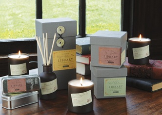
The Library Collection includes such greats as Leo Tolstoy (Black Plum, Persimmon, and Oakmoss), Edgar Allen Poe (Cardamom, Absinthe, and Sandalwood), and Jane Austen (Gardenia, Tuberose, and Jasmine).
DUDE!!! I used to be really bummed that I never got to, say, cuddle up to Tolstoy and smell his ‘pits, or sample some of Jane Austen’s perfume/shampoo combo. But now it’s like I can have these authors – as many of them as I want!!!! – in my room, every night. THANK YOU, PADDYWAX.
140. Cats That Look Like Pin Up Girls
Nothing stimulates my rectangular creativity like being in class. Especially history class. This professor is damn boring, friends. But that’s ok. I have the bloggity to keep me entertained. My boredom is your gain, dear readers.
My readers already know about my affinity for cute animals. But this site takes things a step further. Generally, I care less about cats than dogs, but I still appreciate a good photo of a pet. I generally feel like there is nothing worthwhile on the internet except for (rectangular) photos of people’s pets. And this blog.
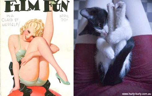
Anyway, this brilliant site, “Cats That Look Like Pin Up Girls,” features a picture of a card of a pin-up girl juxtaposed with a picture of a cat in a similar pose. It’s seriously awesome. Some cat/lady pairs are really impressively well-matched.
Some are less than matching, but I appreciate them anyway.
Perhaps part of my partiality to these comparisons is my personal physical similarity to Buckley. Most significantly, we’re both redheads. I like to say that I could have birthed him from my loins. If I were a dog, that is.
139. Amy Shackleton’s Brushless Paintings
Amy Shackleton is an (adorable) artist based in Toronto. She paints in drips – and produces representational works rather than abstractions. They’re pretty cool, and also pretty. I’m generally not a huge fan of her color choices, but I like her technique so much that I had to feature her on here.
Here are a few of her paintings, for your enjoyment.
Totally-otally cool. Nice job, Amy. I like it!
